
Porto Beirut reaching for new heights
Introduction
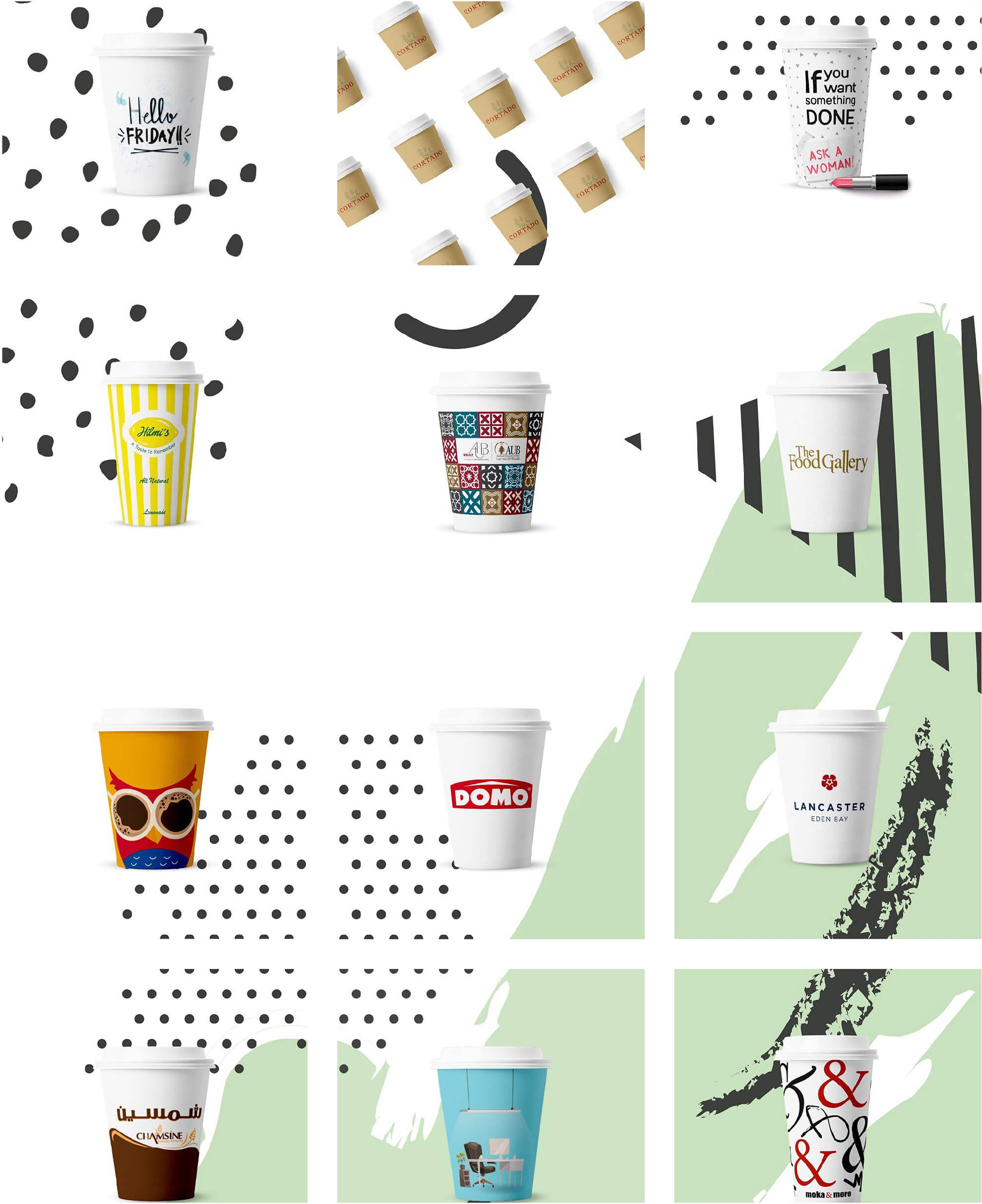
Porto Beirut was the country’s most known paper cups manufacturing company, but it wasn’t presenting itself as an international player. To rise above domestic carriers and attract more international clients, the company came to creative couple to help extend its reach into a world beyond borders.
The challenge
To market Porto Beirut’s appeal, we needed to see firsthand what made it different, its core brand idea, and what the target audience needs. We need to create a recognizable brand that would attract people.
The process
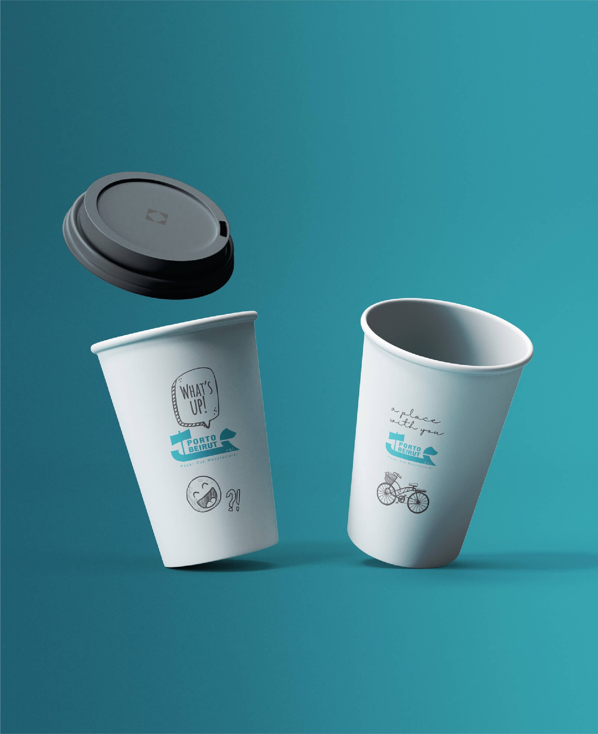
Simple but meaningful changes have been made to the company logo.
The new identity created by our team captured the company’s aspirations. A stylized ship symbolizes the ancient Lebanese coastal trading history. While the color blue reflects the brand’s stability, it also symbolizes trust and loyalty.
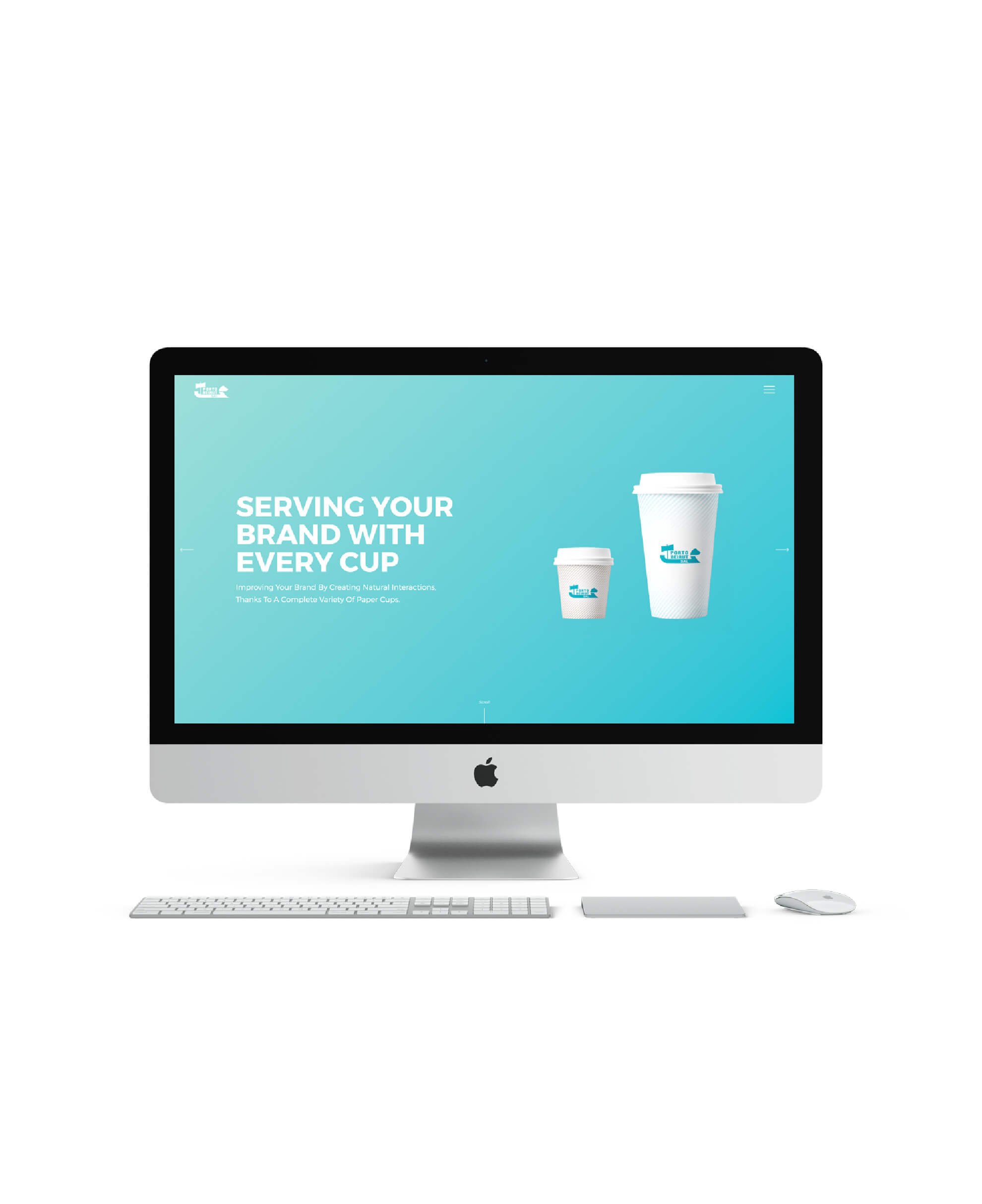
With this so successful simple shift in identity, the brand is equipped to take on new challenges and embrace more change. Thus, we helped the company launch its new website enabling it to attract more organic customers
A well-designed websites offer much more than just aesthetics. We redesigned the brand’s website, ensuring that it reflects the brand identity, story and values, from the minute you enter the home page. This means helping people understand the product, company, and branding through a variety of indicators, encompassing visuals, text, colors and interactions.
For employees, it was inspiring. For visitors, it was conversation starter.
portobeirut.com


