
Revitalizing a Legacy: Paklayan's Rebranding Journey for Market Success
Introduction
A brand's presentation has a profound impact on its success, especially with today's consumers, including the influential Gen Z demographic, who demand authenticity and transparency. After 47 years in the printing industry, Paklayan Printing Press recognized the need to redefine its value proposition and establish a unique position as a market-leading printing company.
The Objective
Our task at creative couple was to develop a contemporary brand identity for Paklayan, enabling them to distinguish themselves from competitors and craft a new website experience that effectively communicated their values, showcased their accomplishments, and outlined their future strategies.
The Strategy
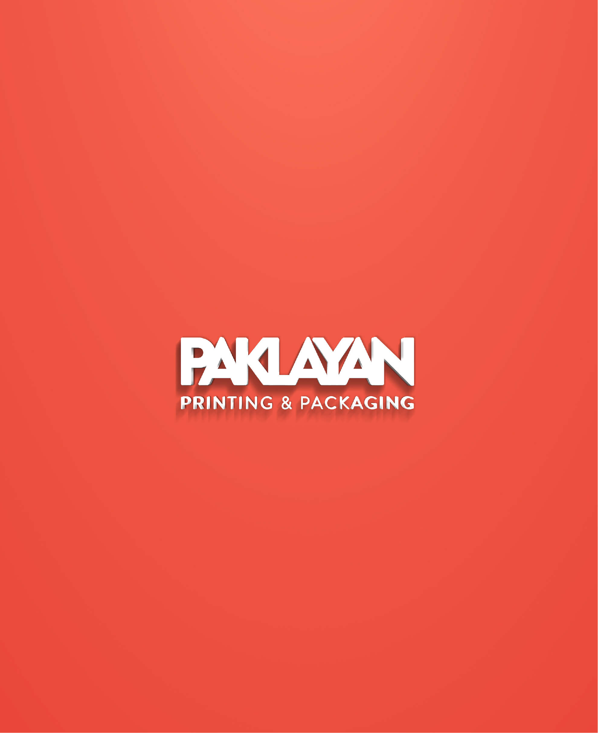
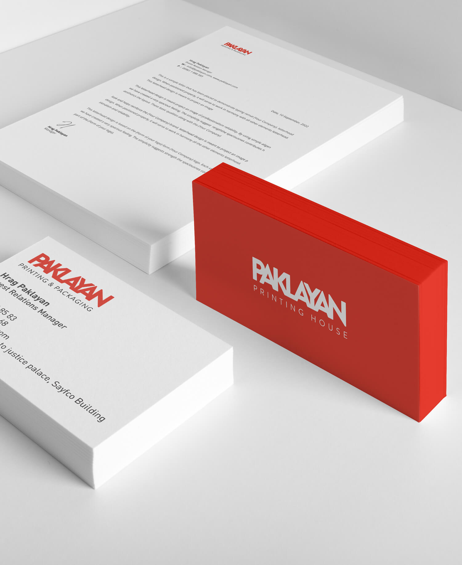
To differentiate Paklayan in the B2B sector, we designed a vibrant, bold identity to reflect its dynamic vision. The new logo interconnects the letters of Paklayan, with each letter overlapping to symbolize the unity of the family business, where all members work together to exceed expectations. The all-caps, large lettermark logo also evokes the company's heritage and significance, while the chosen colors represent energy, passion, strength, and action.
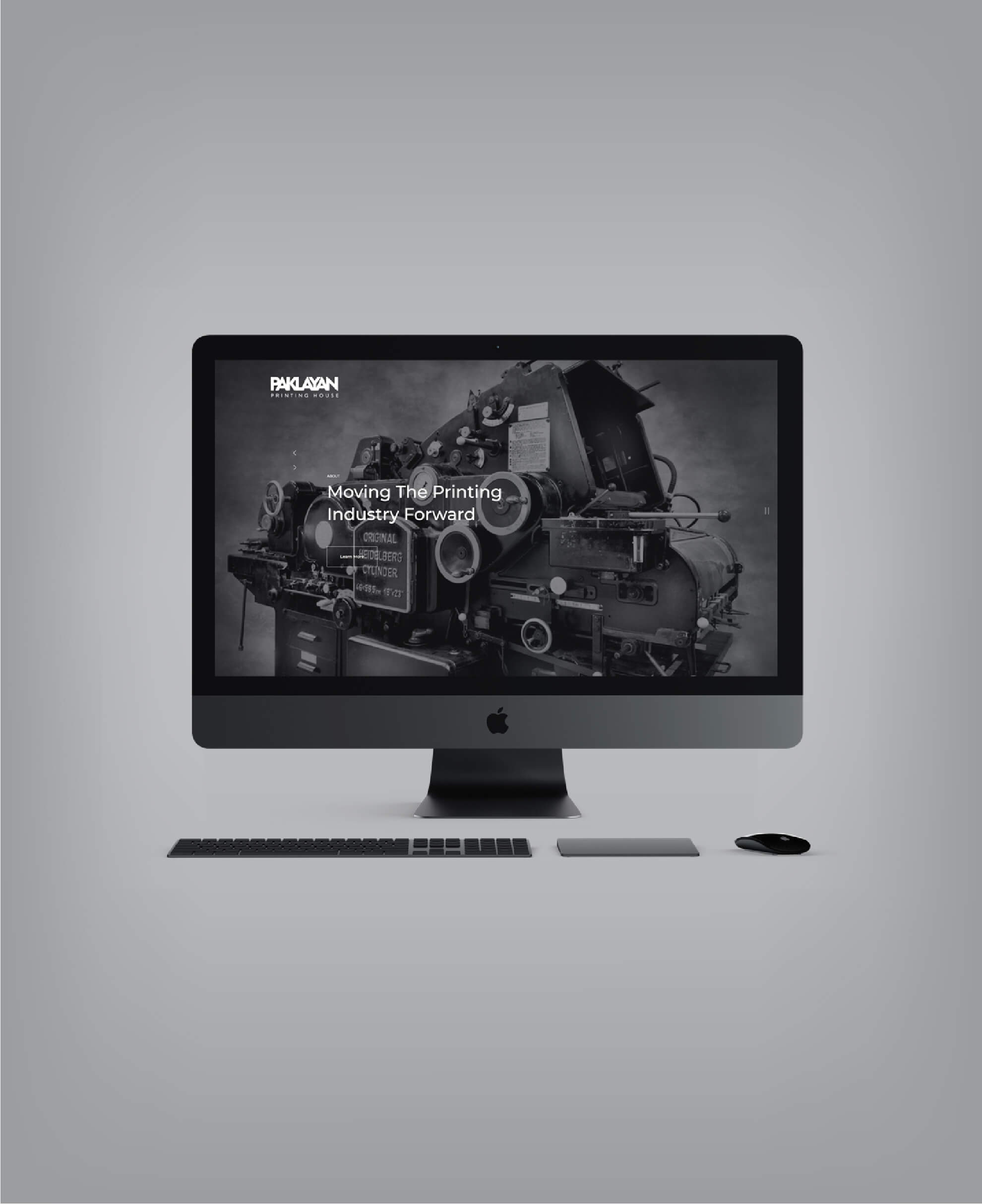
We began with the website, employing a prototypical process that engaged the client in shaping the creative idea through an iterative journey approach. Our focus was on gaining a deep understanding of the users, their needs, values, abilities, and limitations, while conveying the values of the rebranded Paklayan.
The Impact
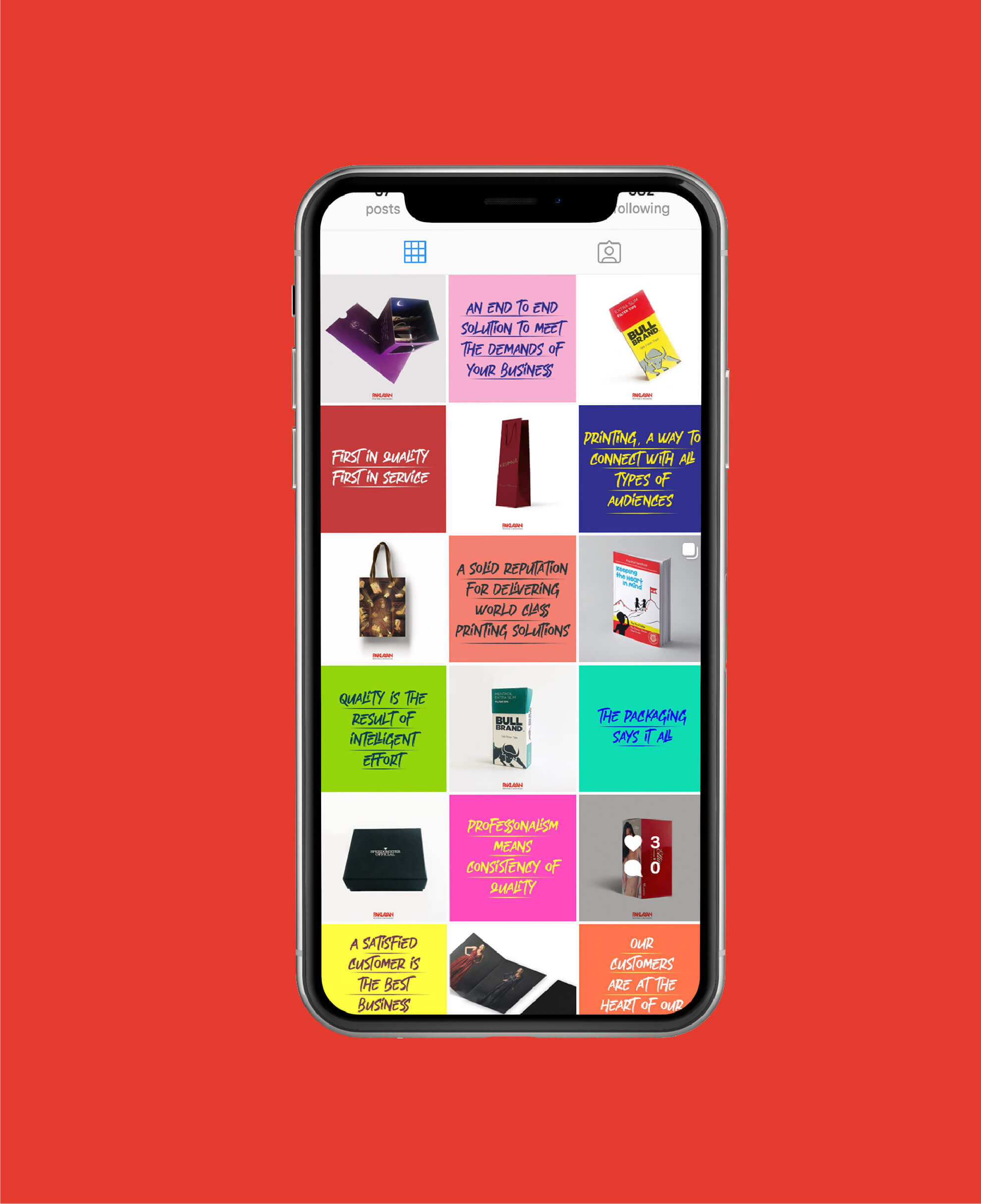
Equipped with a well-defined business strategy, a compelling brand story, a new website, and a revitalized visual identity, Paklayan is poised to capture new markets by delivering high-quality printing products and reliable, authentic services that ensure maximum customer satisfaction.
paklayan.com


